 Quick Enquiry
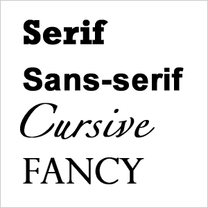
Font is crucial in technology. No matter if you’re creating a website, an app, or an advertisement, font should be one of the first things that you look at.
What does your font say about you?
Are you
- Modern?
- Old?
- Exuberant?
- Stylish?
- Rigid?
- Serious?
- Free-spirited?
- Open?
- Severe?
- Whimsical?
Odd though it may seem, any one, if not a combination, of these labels can be attributed to you the second that a customer sees your page.
That’s right. All that work that you put into a free, fun article doesn’t matter. If your page and font don’t mimic what you’re about, then you are fighting a losing battle.
Consumers have actually stated that the use of some fonts can lessen usability on a site—now that’s something to be scared of.
Things to Consider when Choosing a Font for Your Web Design:
- Font type
- Font Colour
- Font Size
- Font Effects
- Bold, italic, or underlined?
- Font Placement
All of the aforementioned are crucial in getting the best results from your font and webpage. You need to analyze them.
Font type:
Is your site serious or carefree? Are you looking to stand out or fit in? What do you want to portray on your site?

Font Color:
Is black way too boring? Sometimes black might be monotonous and dreary, but when different colors are used, they can be garish. You really need to analyze what colors suit your site because colors can either make your site stylish or tasteless. When thinking of colors, make sure to add the color of your background into the equation.
Font Size:
Do you want your font to be
BIG
or small?
Oftentimes, saying the same thing in different font sizes can have completely different meanings, no matter what your intentions.
Font Effects:
Similar to above, you want to make sure you get your tone right. Highlighting aspects is important, but is there really a need to do this? LOOK HERE.
Font Placement:
Super, super important. Do you want it at the top of the page? At the side? On the bottom? What width do you want the margins of white space around your font to be? This is all very important and needs to be considered. Also, for the most part, try to justify your text if you can. It looks much better!
More Articles From Your Favorite Cork Website Design Company:
For more articles on how to make sure that your website is the best that it can be, then click here and see everything that you need to know.

 Quick Enquiry